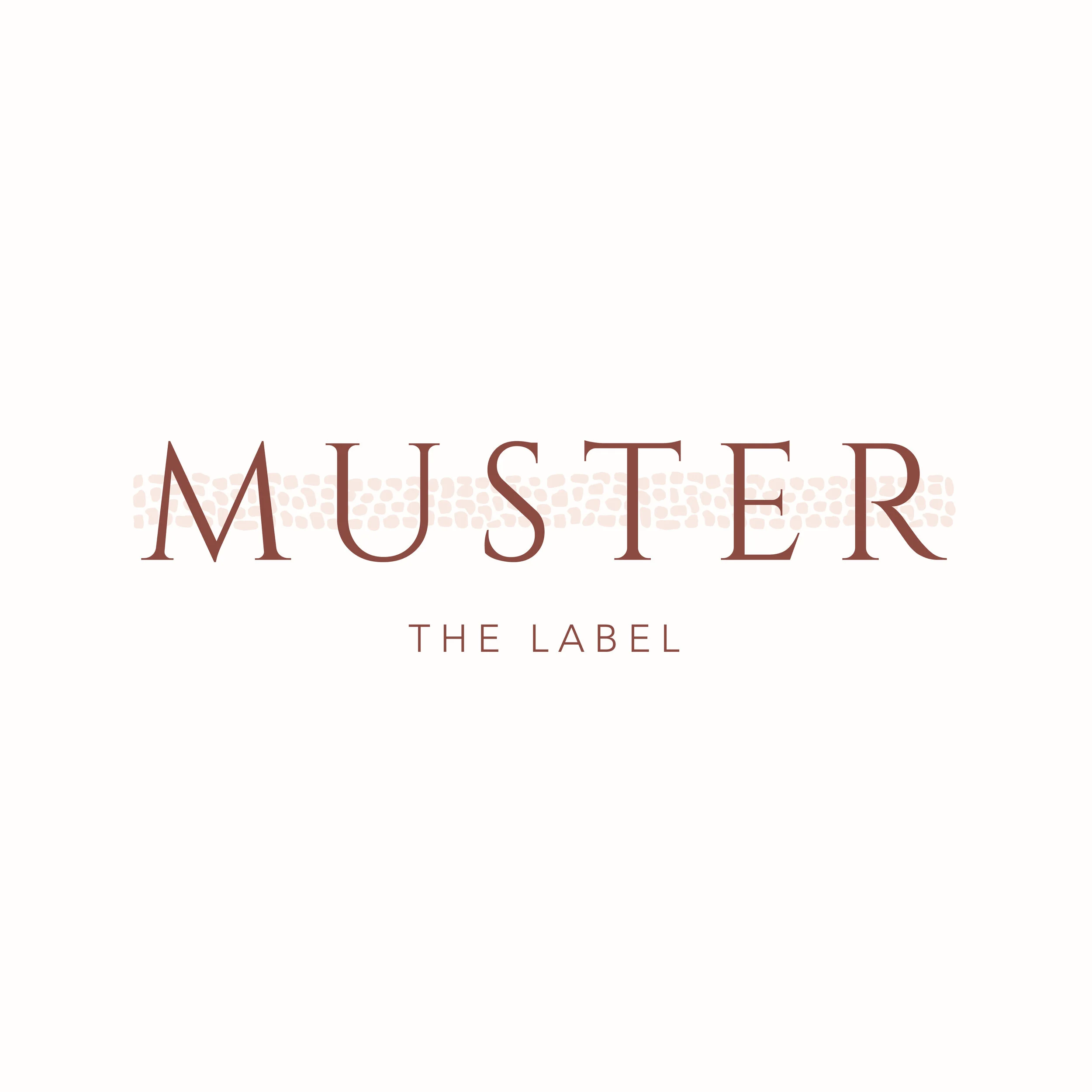
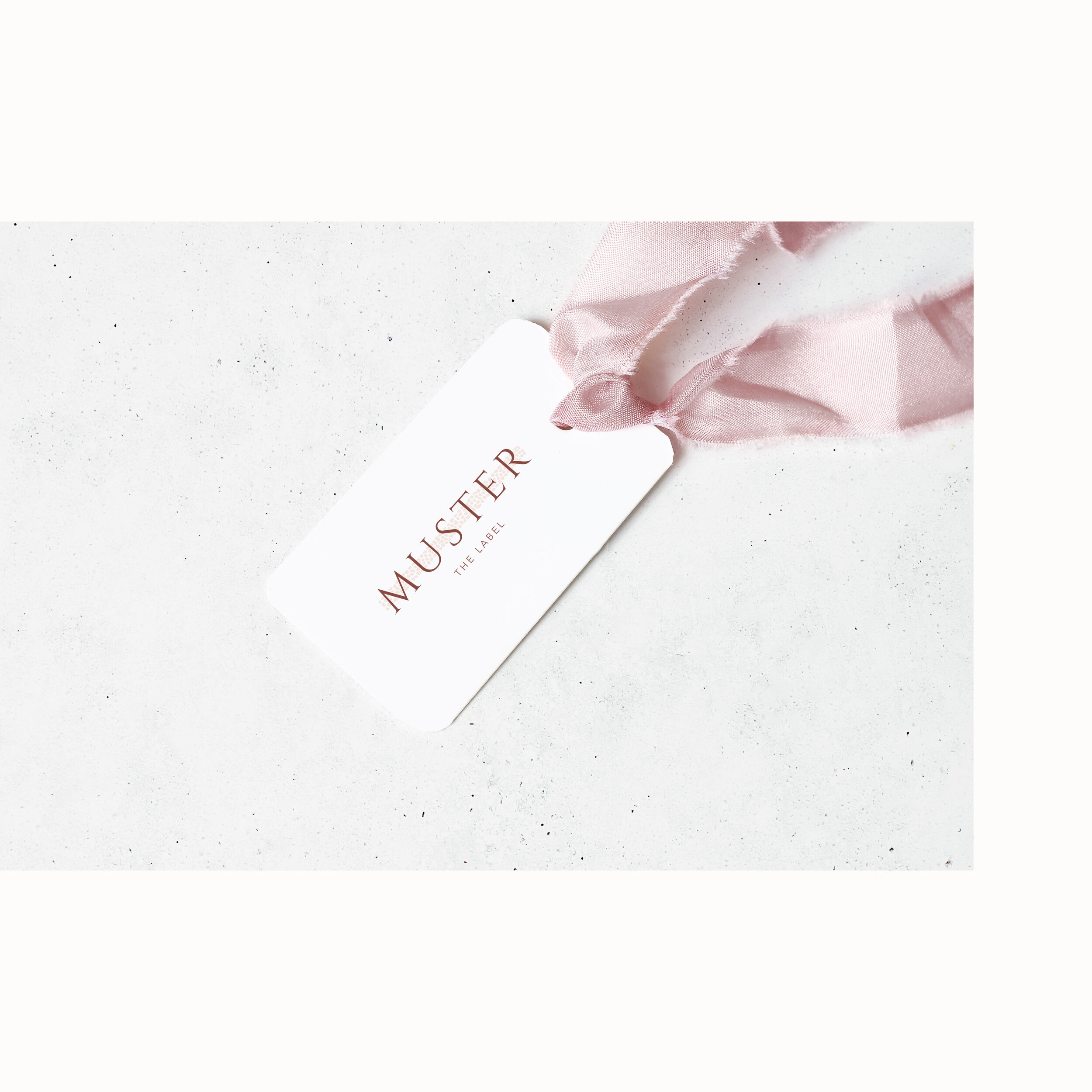
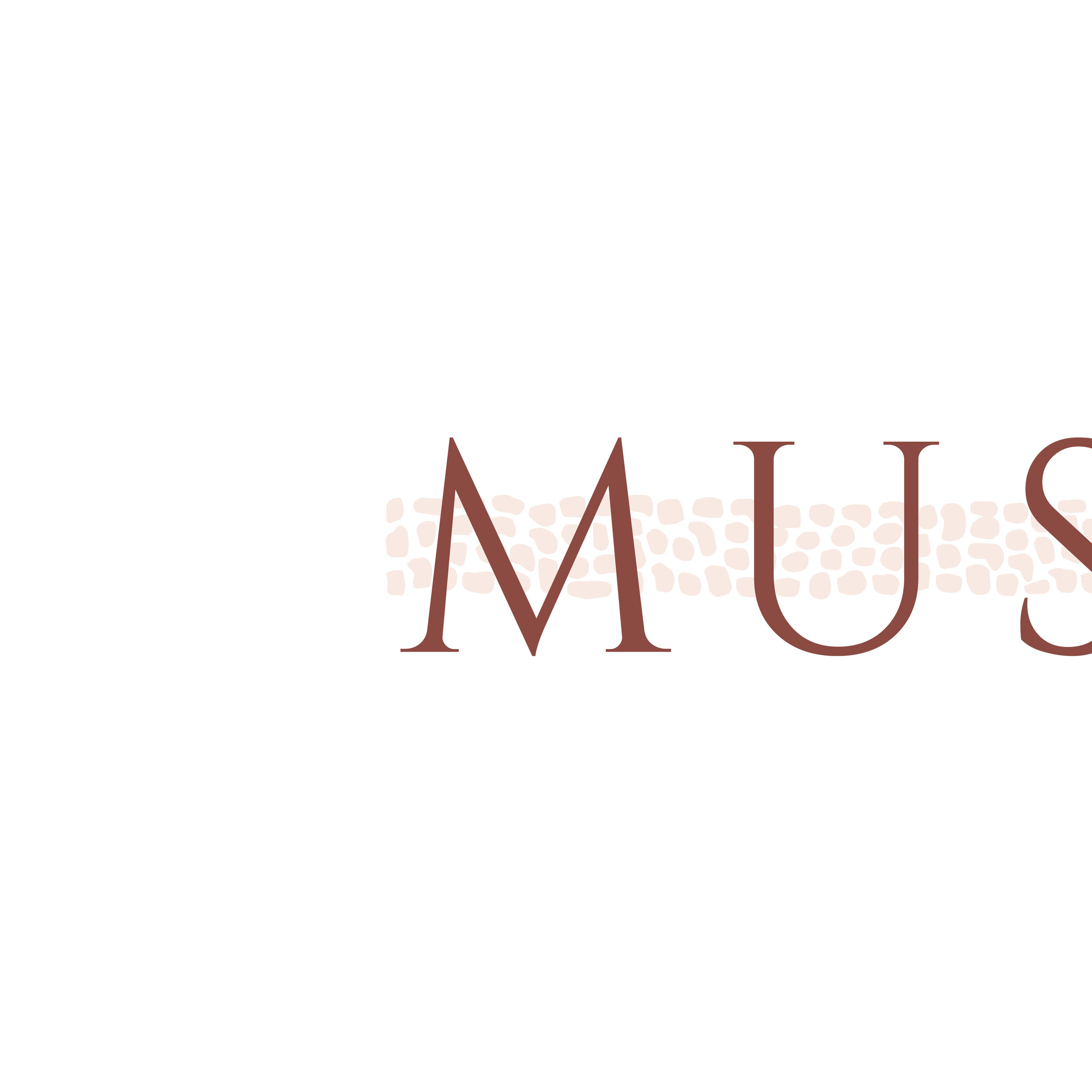
Muster the Label
Welcome to the branding for ‘Muster the Label’.
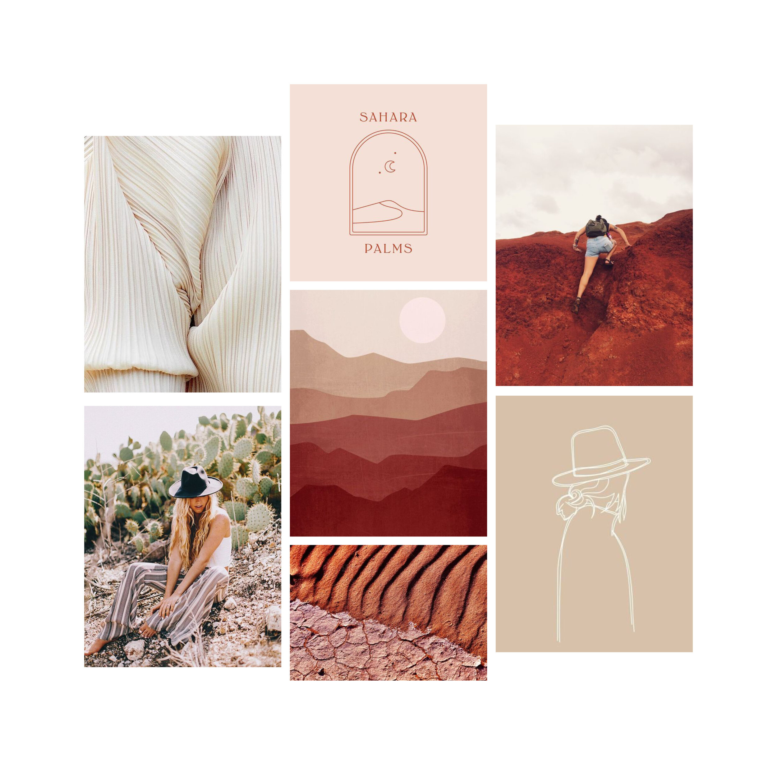
Each month I create a moodboard to inspire my personal projects. My aim is to create a brand to go with these moodboards each month. It’s a way of stretching my skill set and creativity, and doing work I really love without a client brief. It’s also a way of showing off what I can do and attracting the kind of work I love.
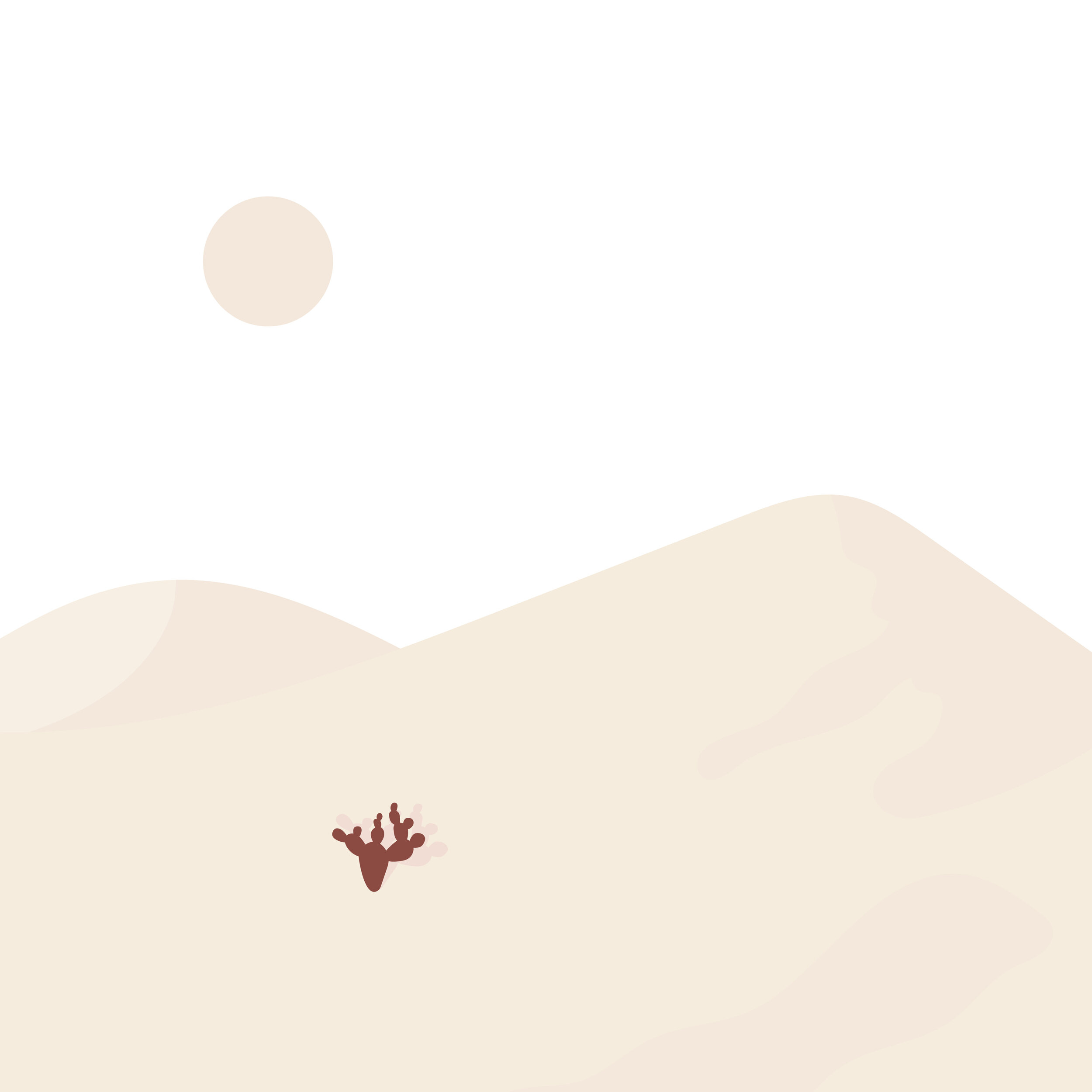
This month my personal projects have followed the theme of ‘Red Earth’, inspired by my recent trip out to Charleville visiting my grandparents.
Our land is so incredibly dry, but the people are resilient and tough.
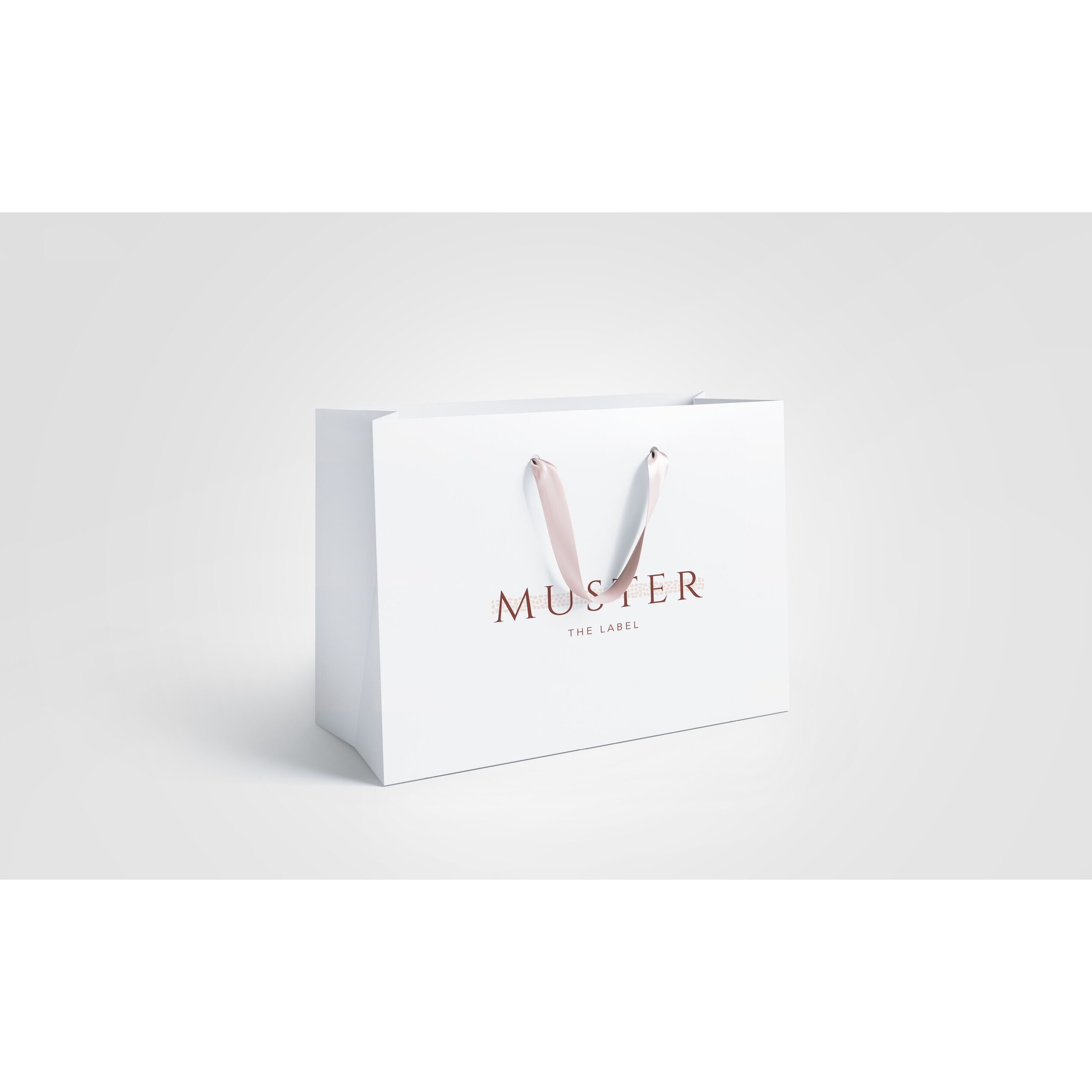
I wanted to create a brand to go with this month’s theme and capture the spirit of the women out west. I drew little shapes to represent the cracked and dry earth and placed it like a band behind the type to represent how these wise and beautiful women band together in tough times.
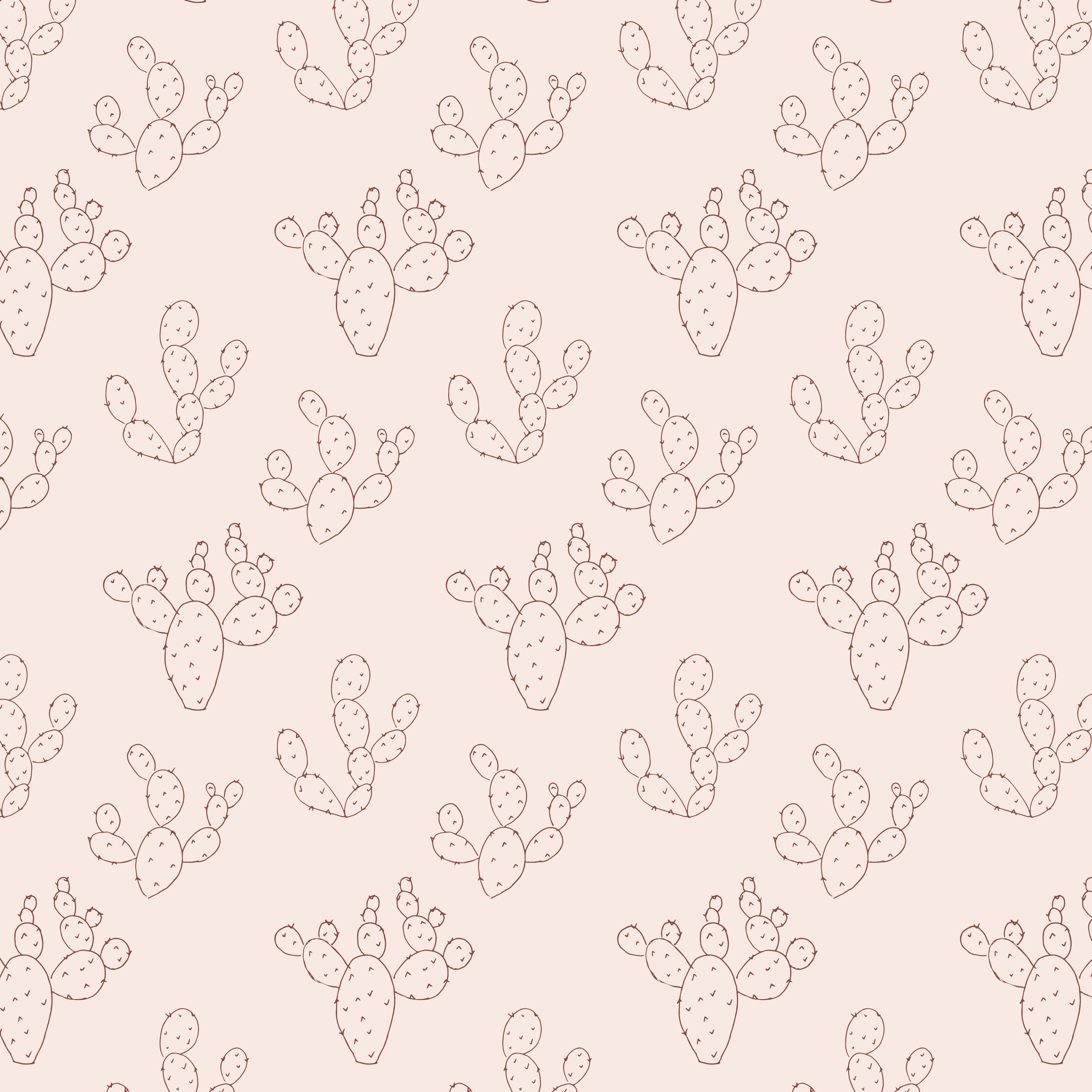
I’ve used the cactus as a subelement for this brand. Although a pest, the prickly pear is beautiful in its own right.
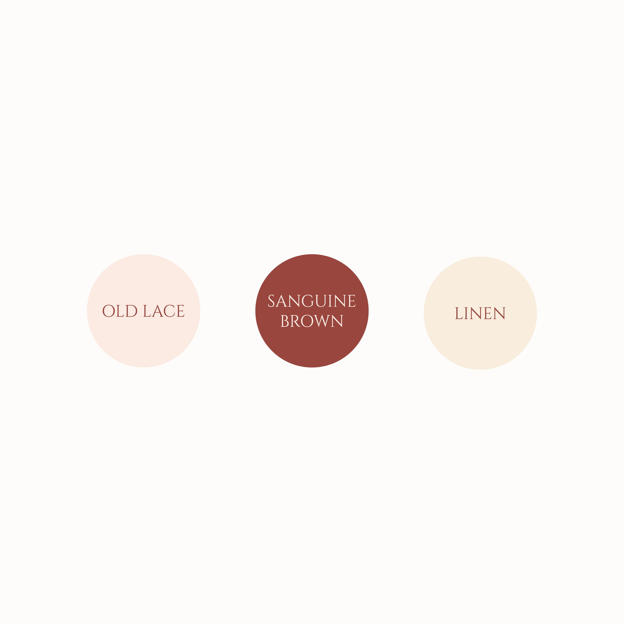
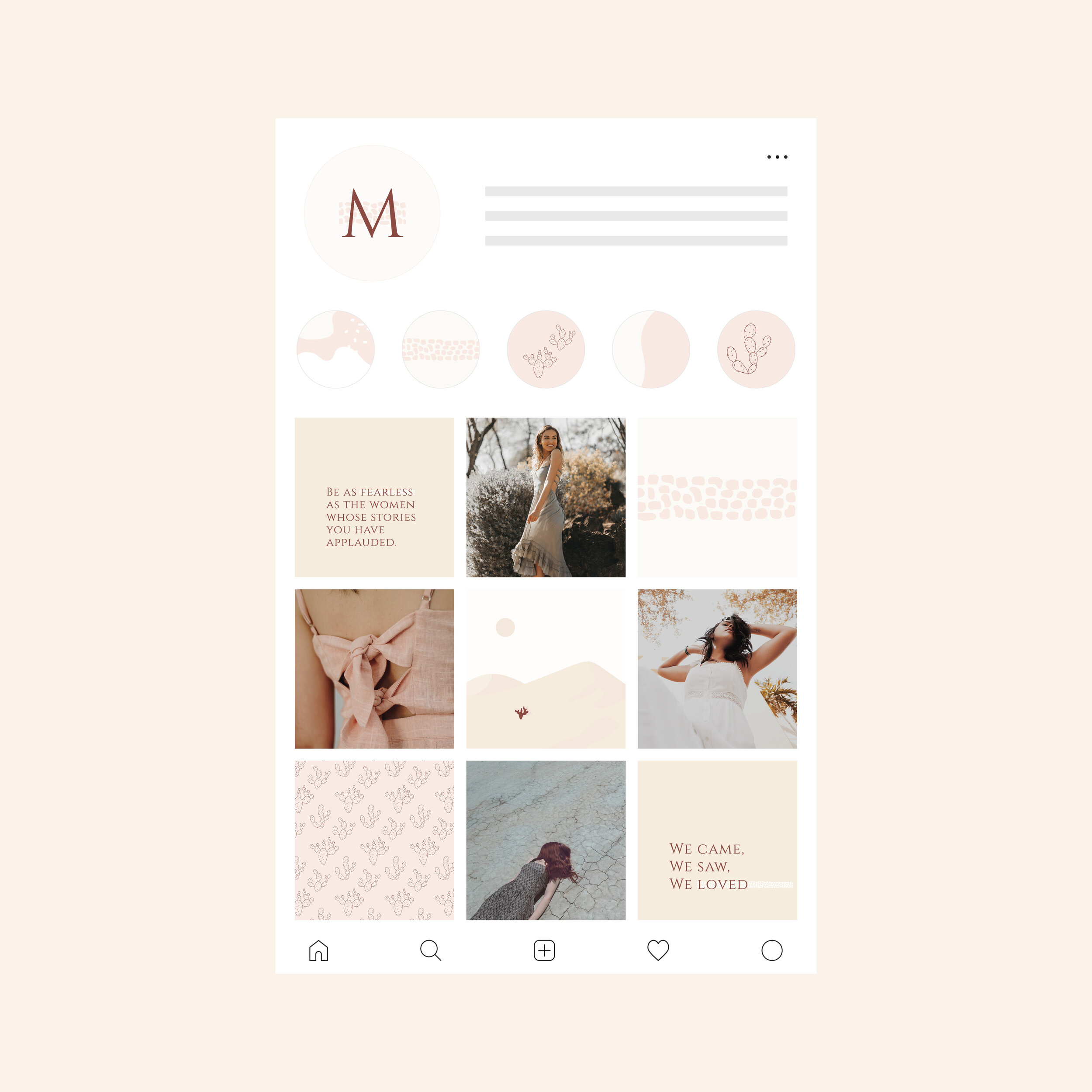
Muster the Label represents sustainability, quality, longevity and resilience. I’ve communicated this through an elegant typeface, earthy colours, simplicity and lots of white space.
This brand came so easily to me this month. I had a really clear visual in my head and when I took pen to paper and mouse to computer, the execution worked out just the way I wanted to. I had a lot of fun putting this one together and I hope you all enjoy it.