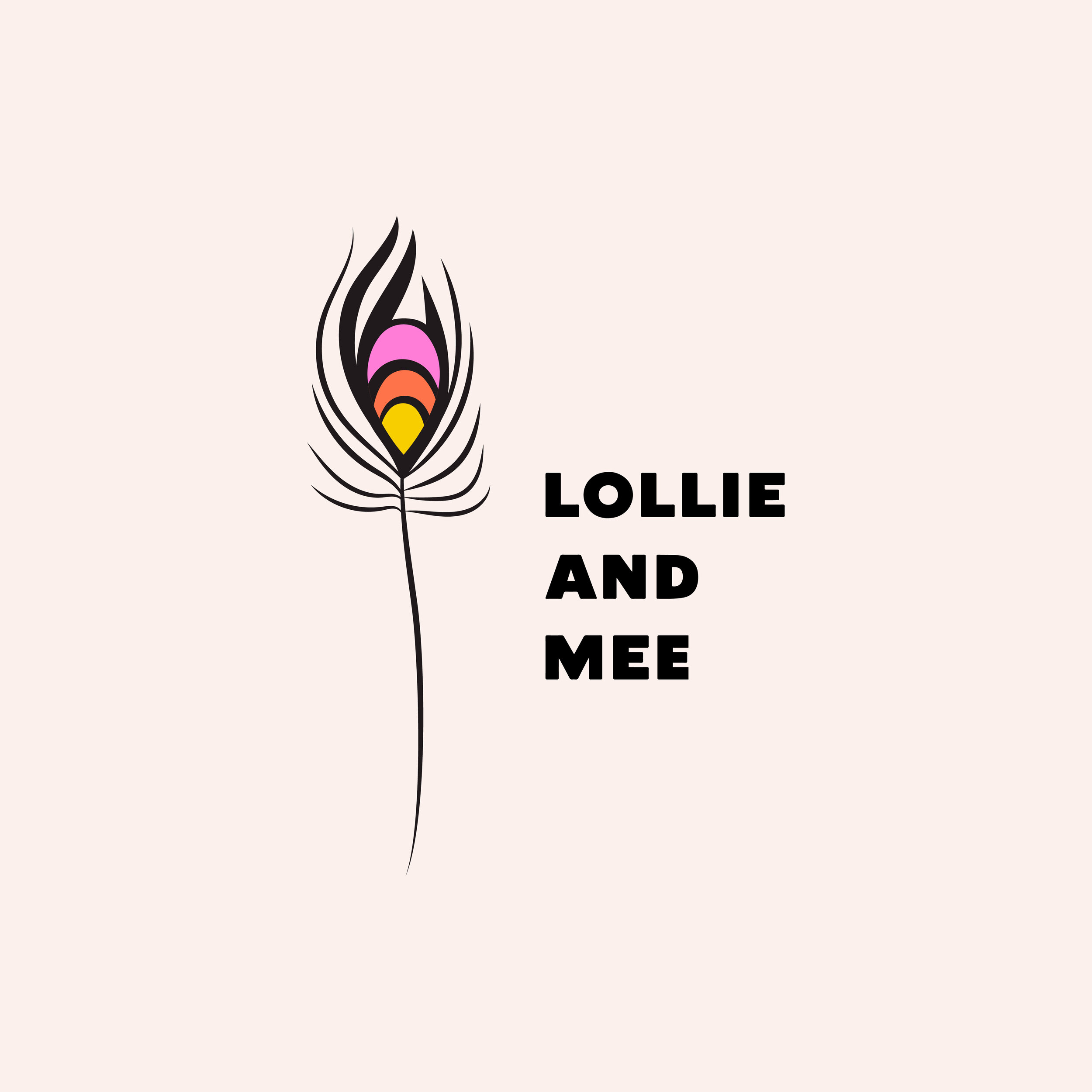
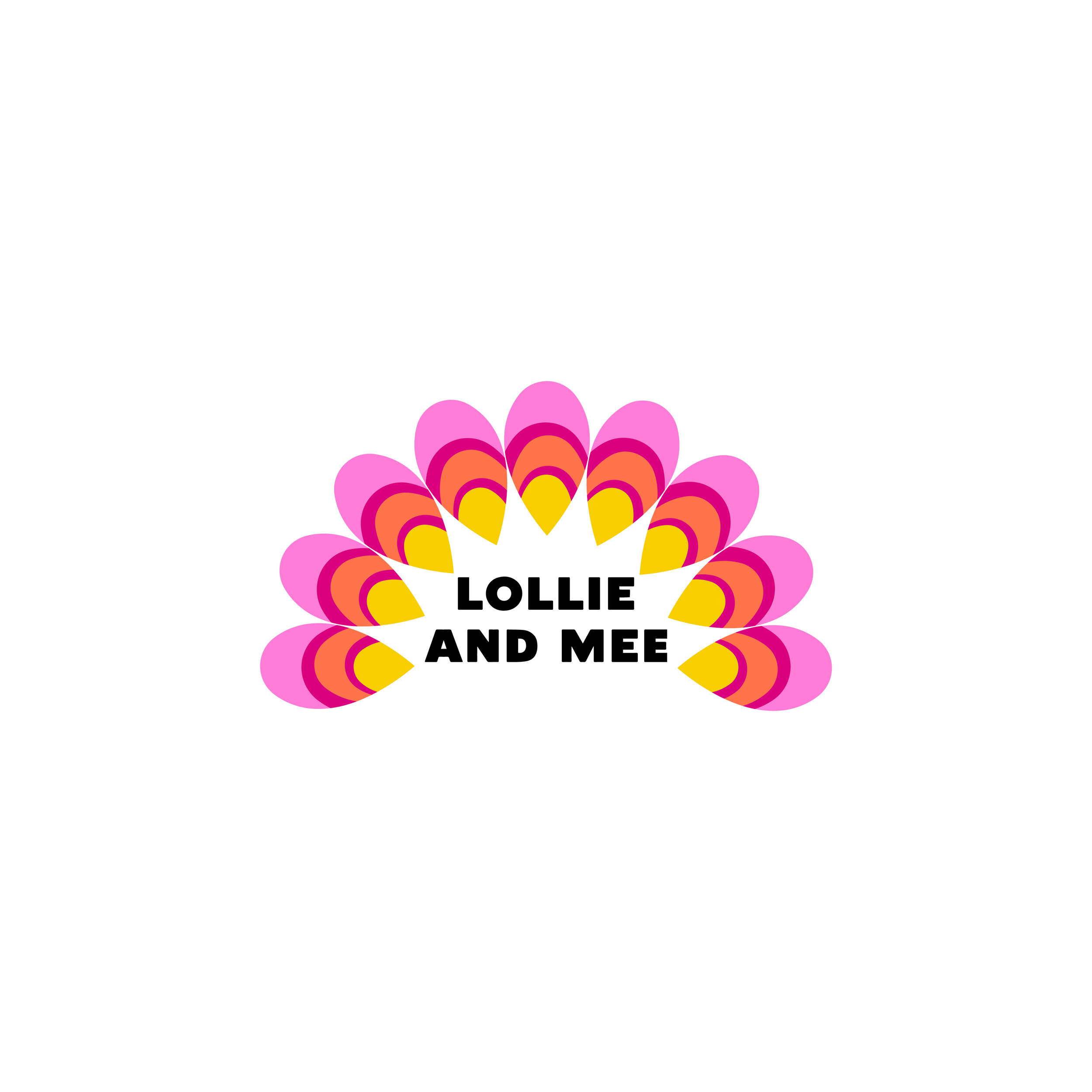
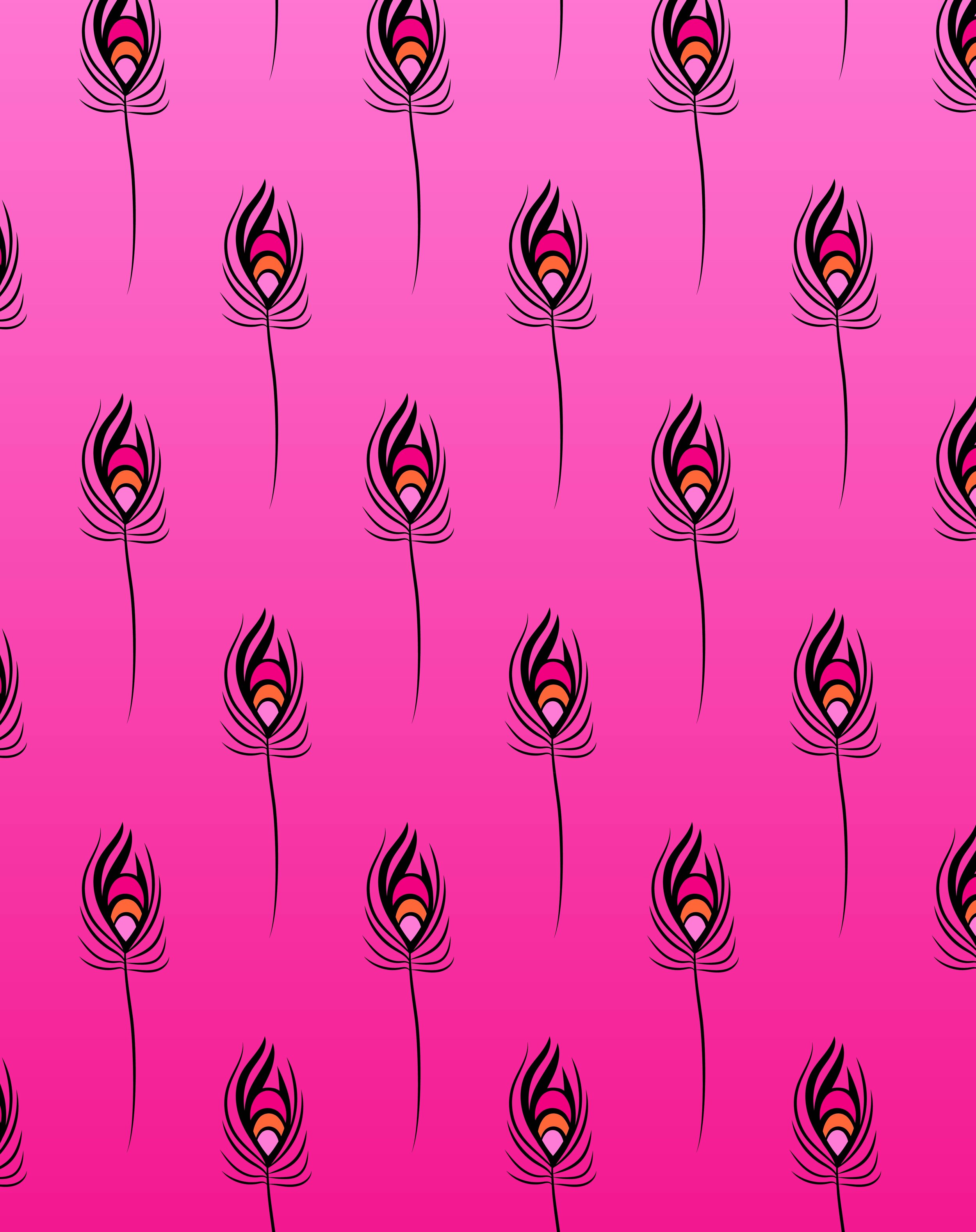
Lollie & Mee
How do you design a brand for a product that is really bright and colourful?⠀
⠀
When Meegan from Lollie & Mee and I sat down for her deep dive session, this was our main question. We could create a neutral brand that would allow her bright earrings to shine. Or we could create a brand that shows the colour and playfulness of these gorgeous handmade accessories. ⠀
⠀
What became very obvious in our session together was the ‘duality’ of the brand. The pieces can be worn with a really bright outfit to jazz it up even more, or they can be worn with a neutral outfit as a pop of colour. So we began to ideate how we could communicate this visually and we came up with the idea of a peacock. ⠀
⠀
A peacock can stand tall with their tailfeathers laying along the ground, just a glimpse of their beautiful colours. Or they can walk around with their feathers splayed for all to admire. ⠀
⠀
So here we have it! A beautiful bright peacock feather, a bold blocky font, bright bold colours paired with a soft neutral pink. I’m absolutely in love with it. There was a lot of thought that went into this brand and I felt that it creatively challenged me, in a good way. ⠀
⠀
And I’ve absolutely loved working with the gorgeous Meegan who has a true passion for her business. I could feel her full faith in me, which makes my job one thousand times easier. ⠀
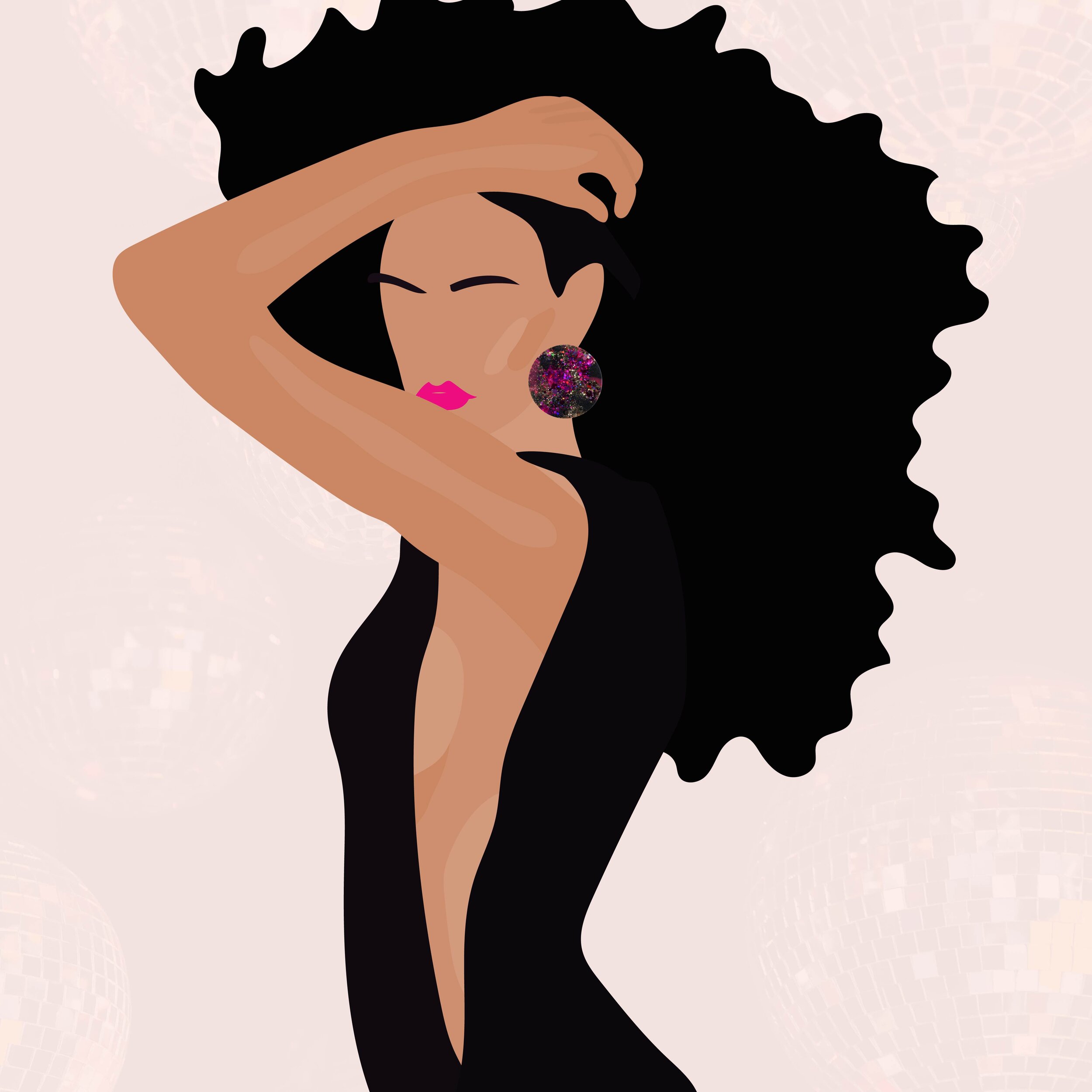
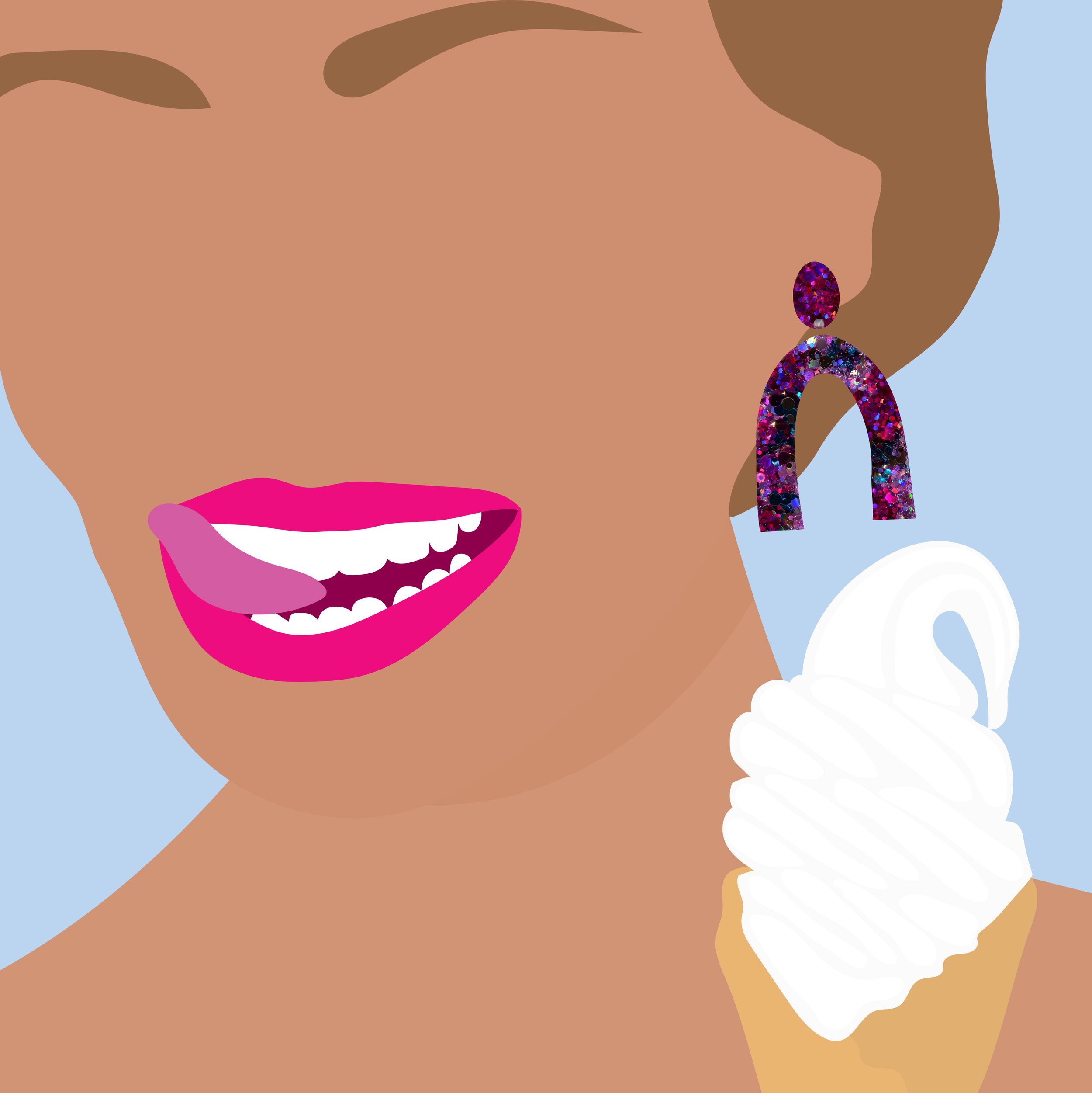
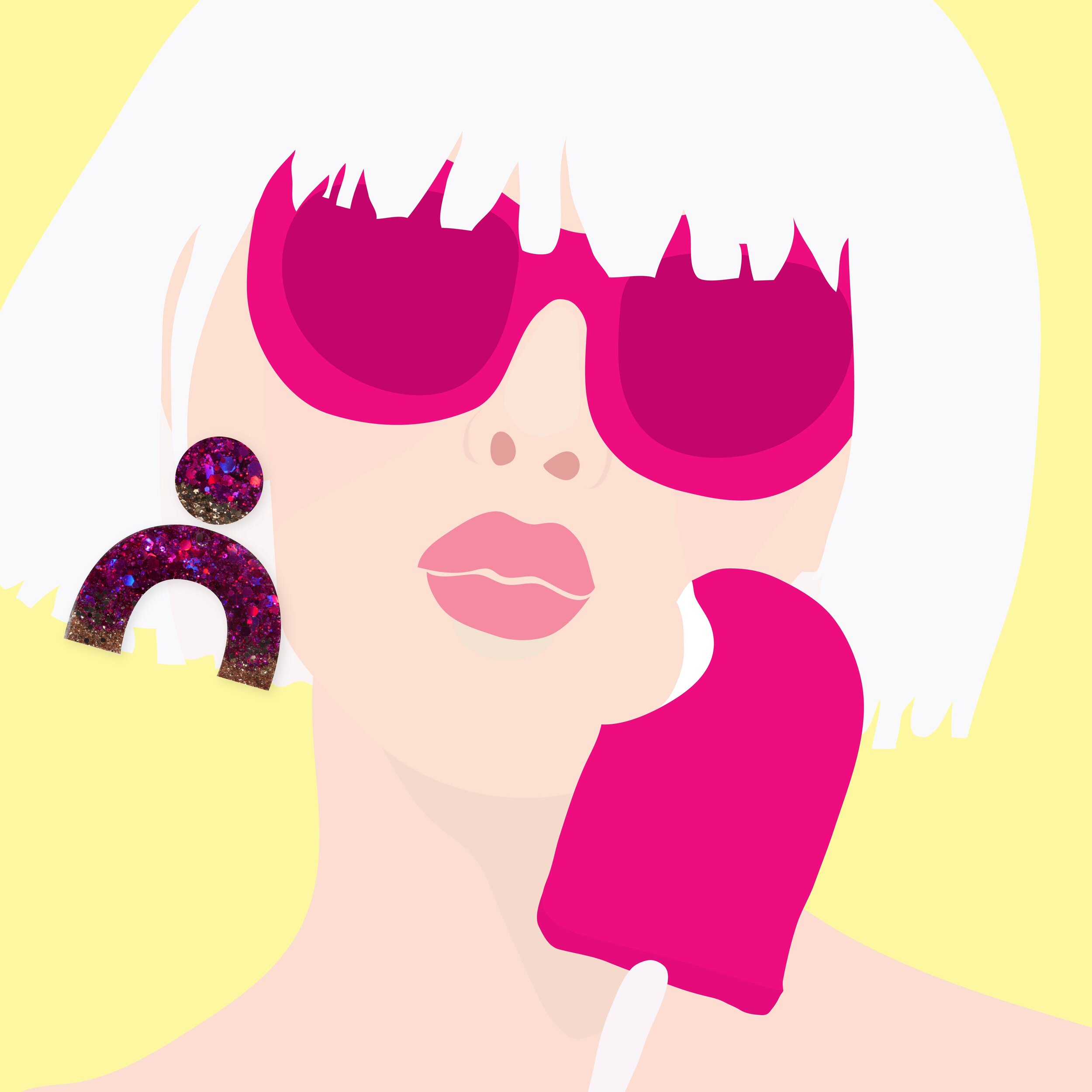
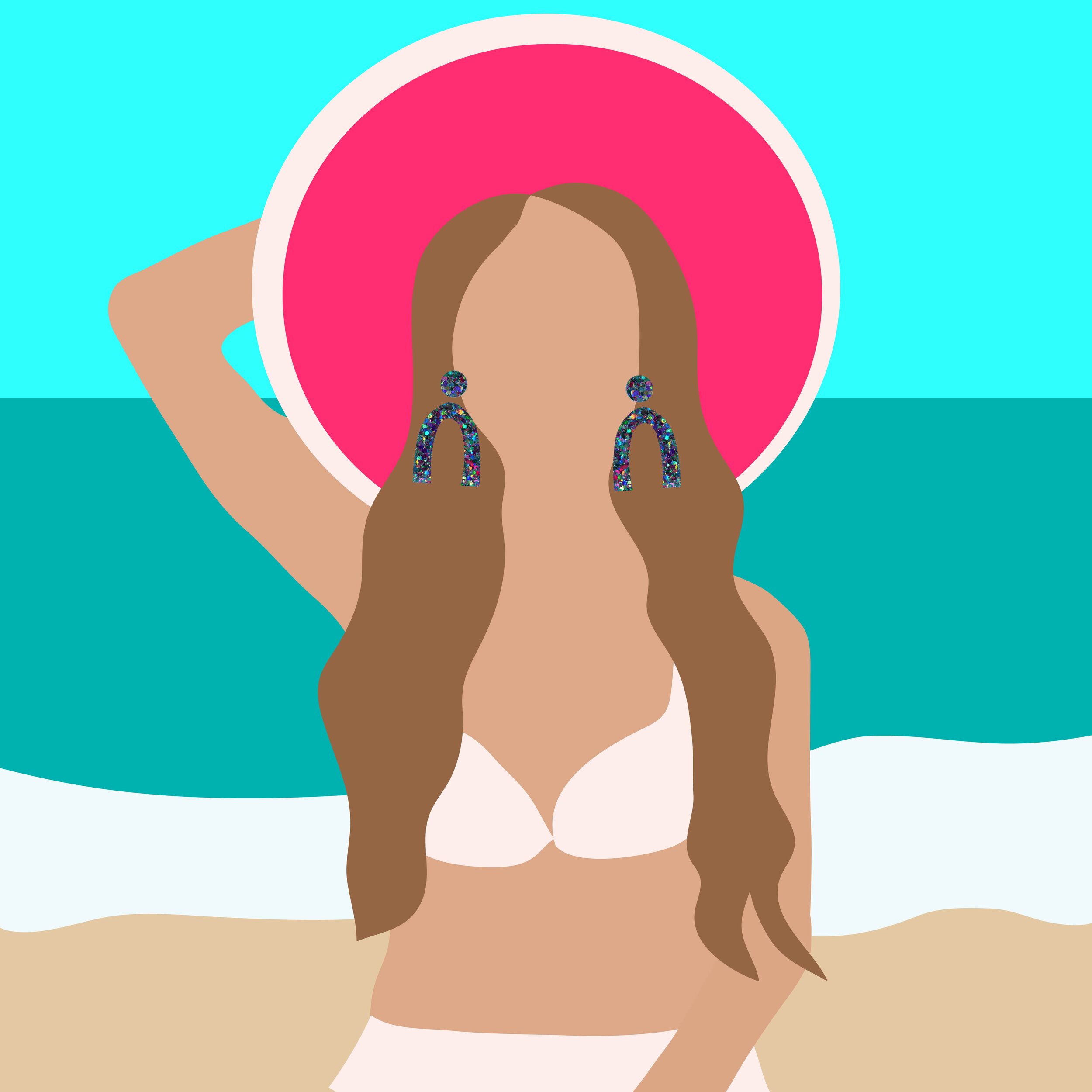
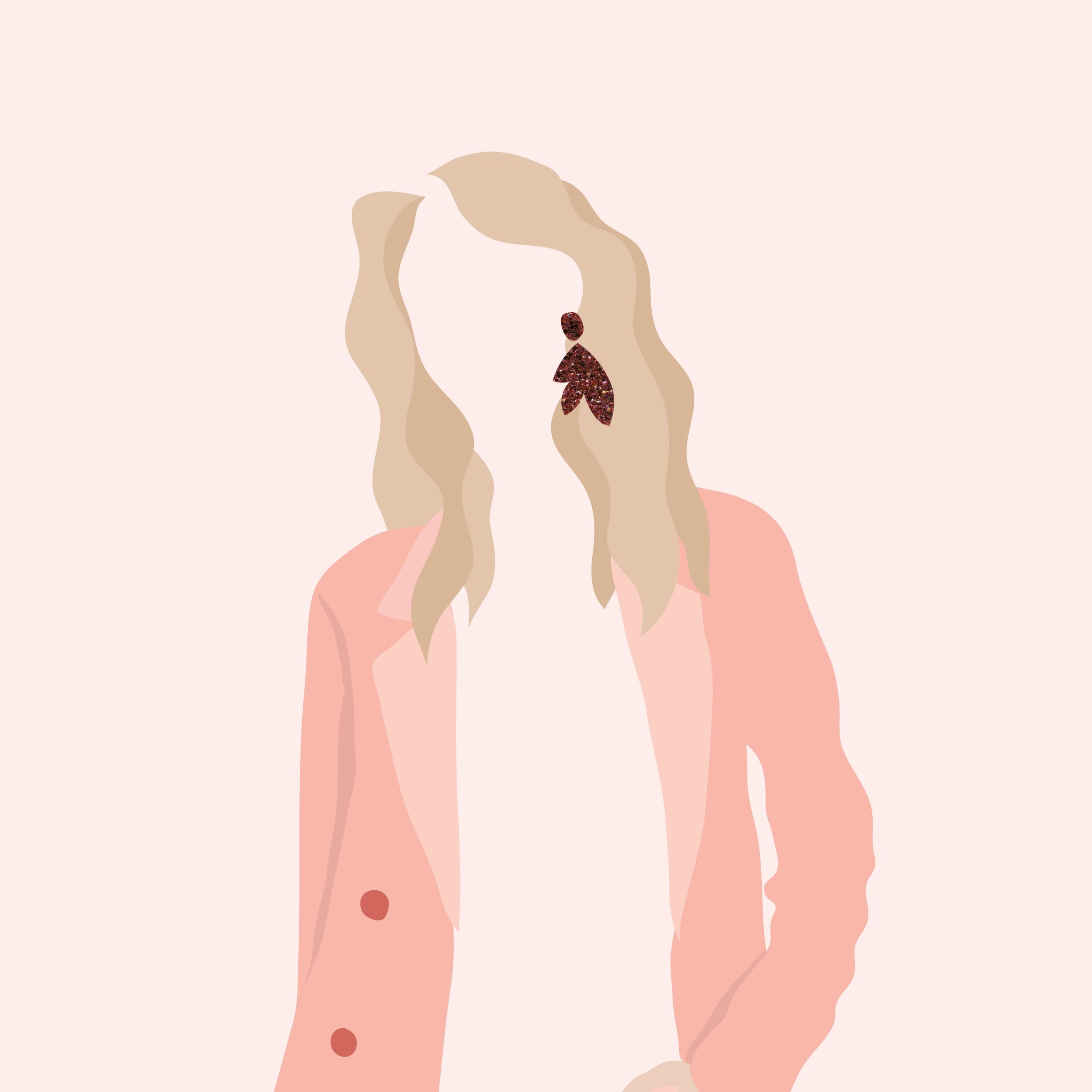
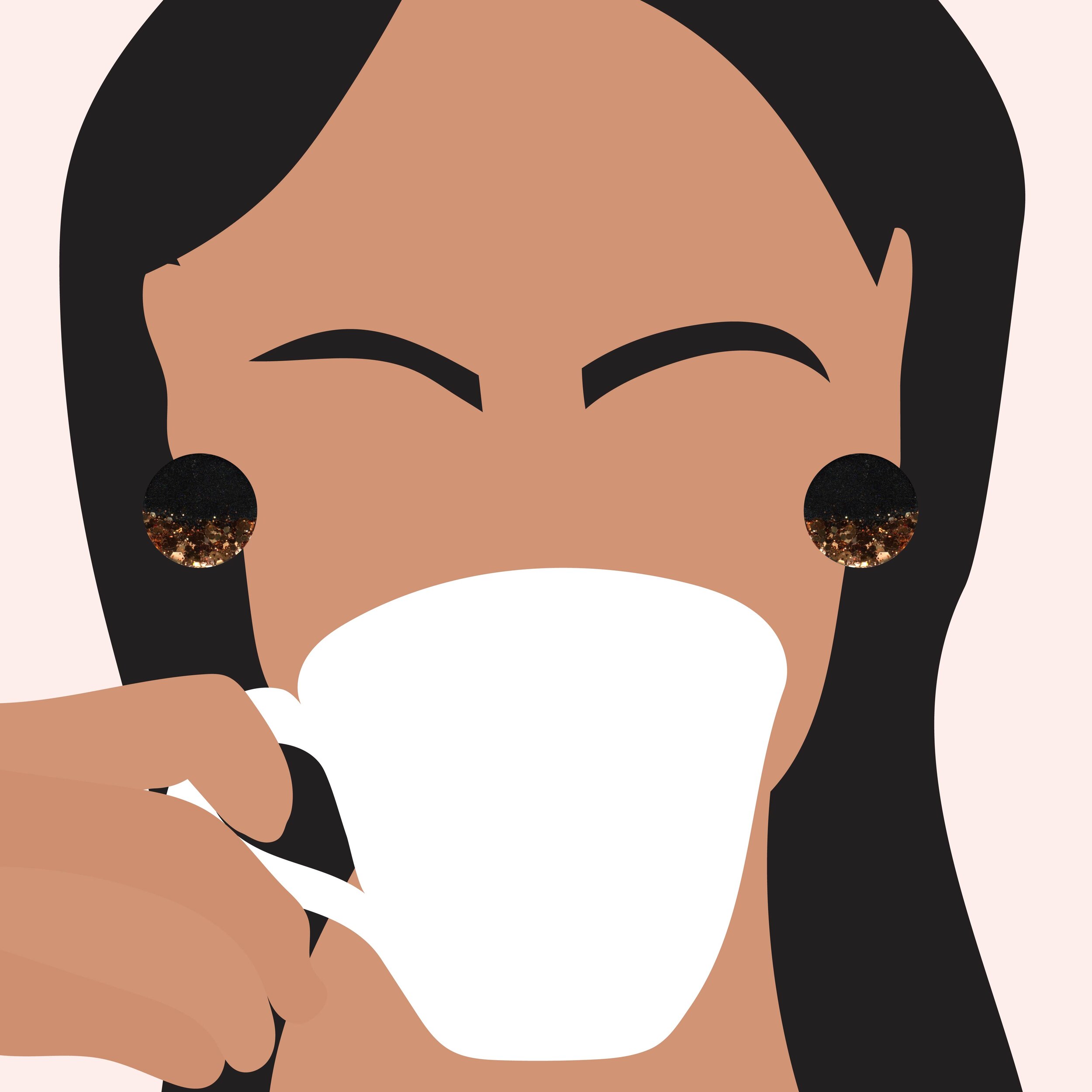
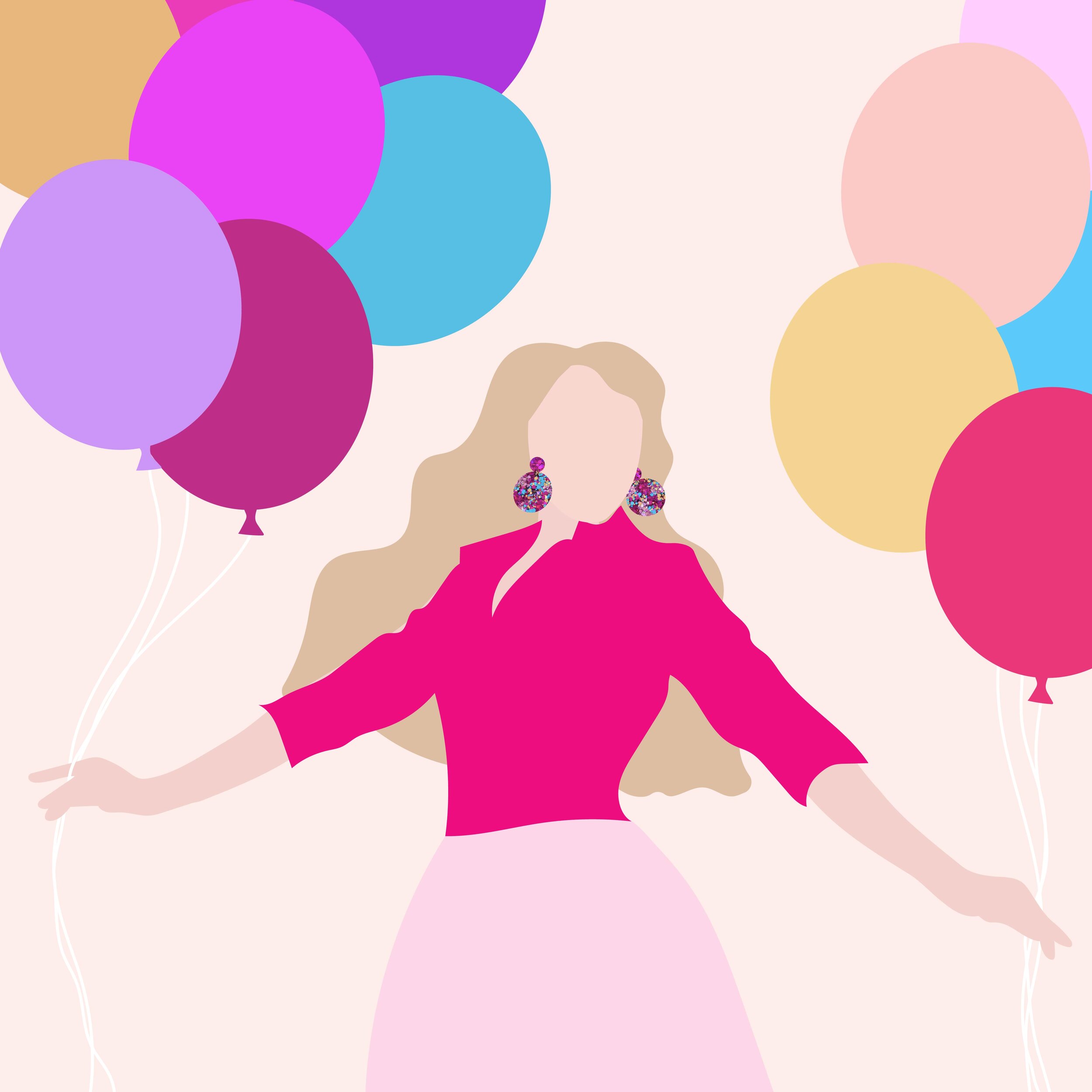
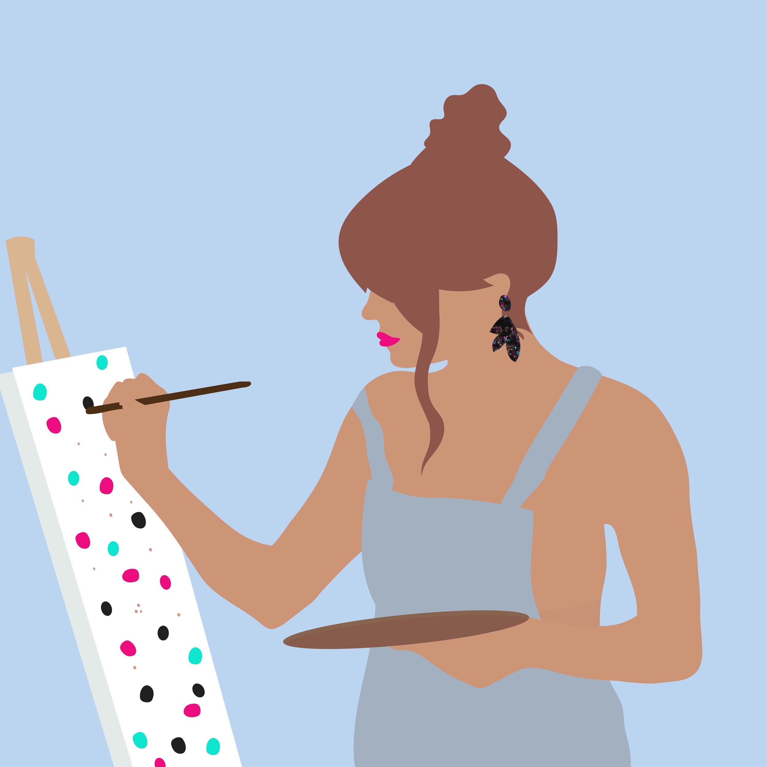
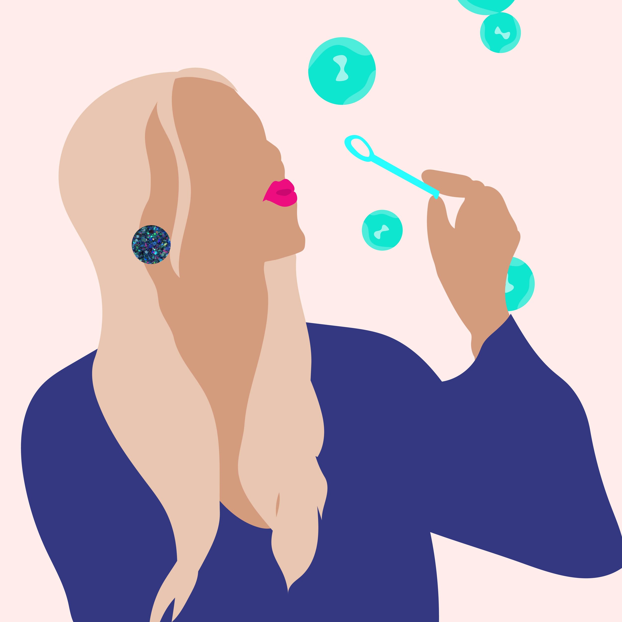
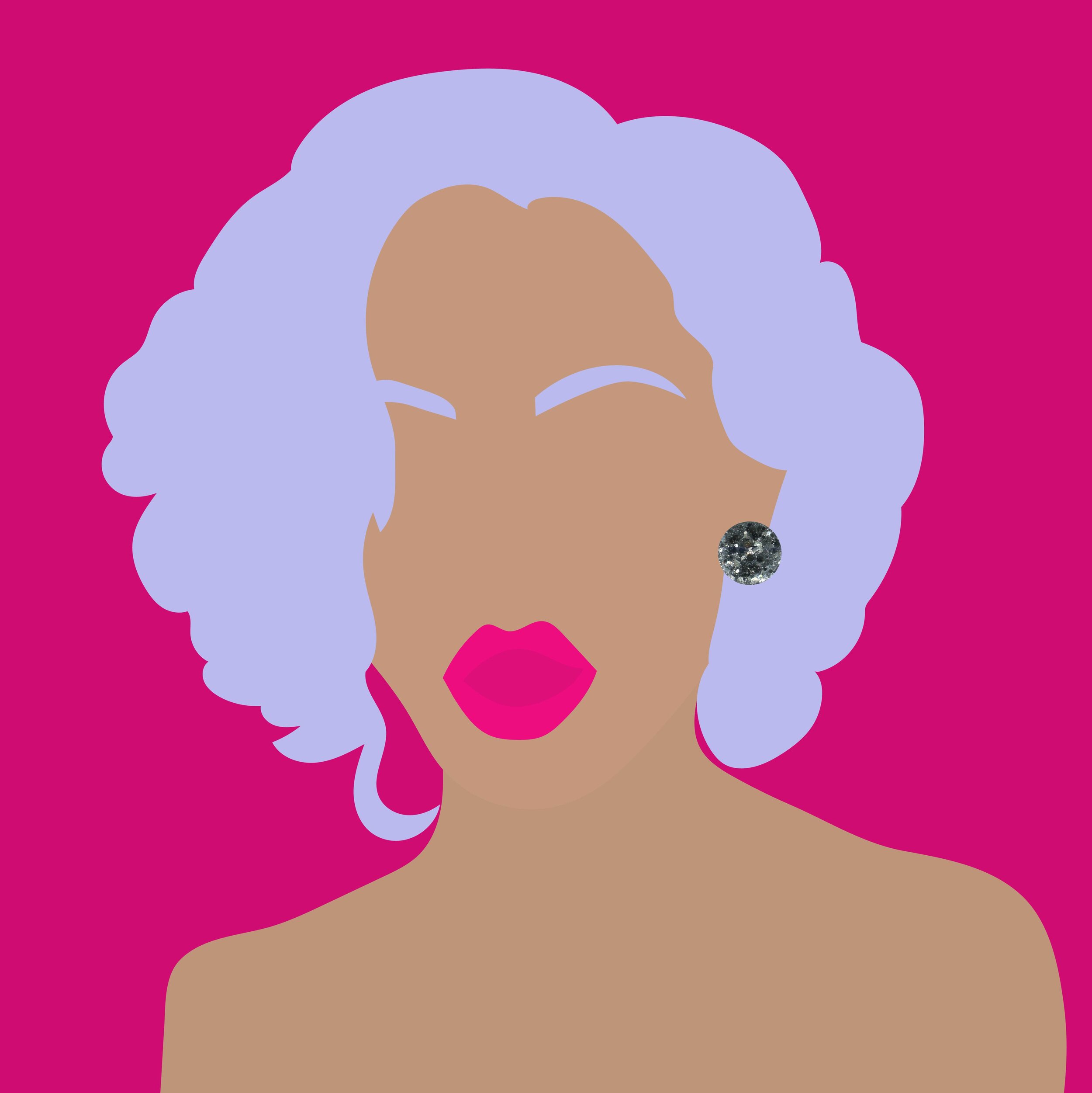
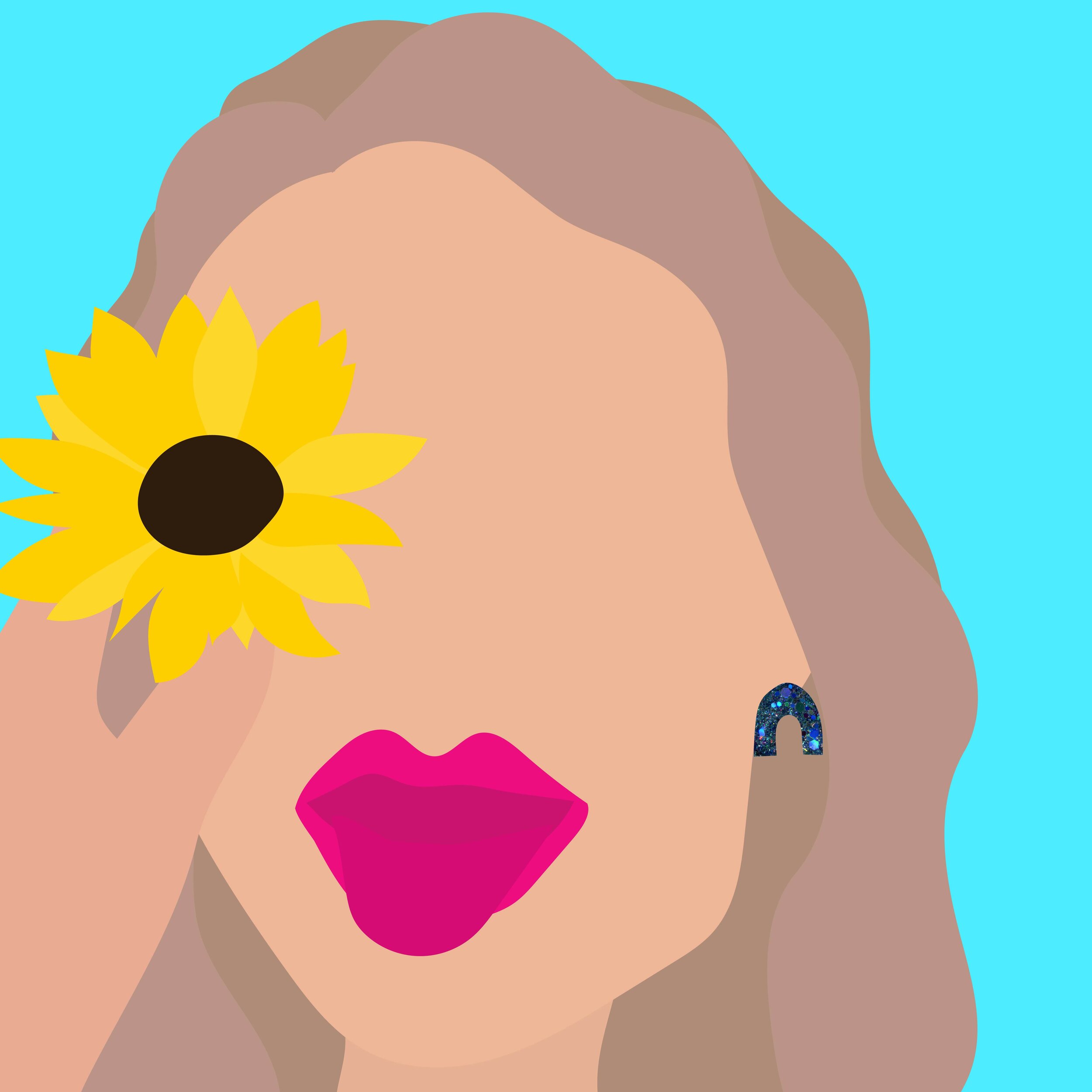
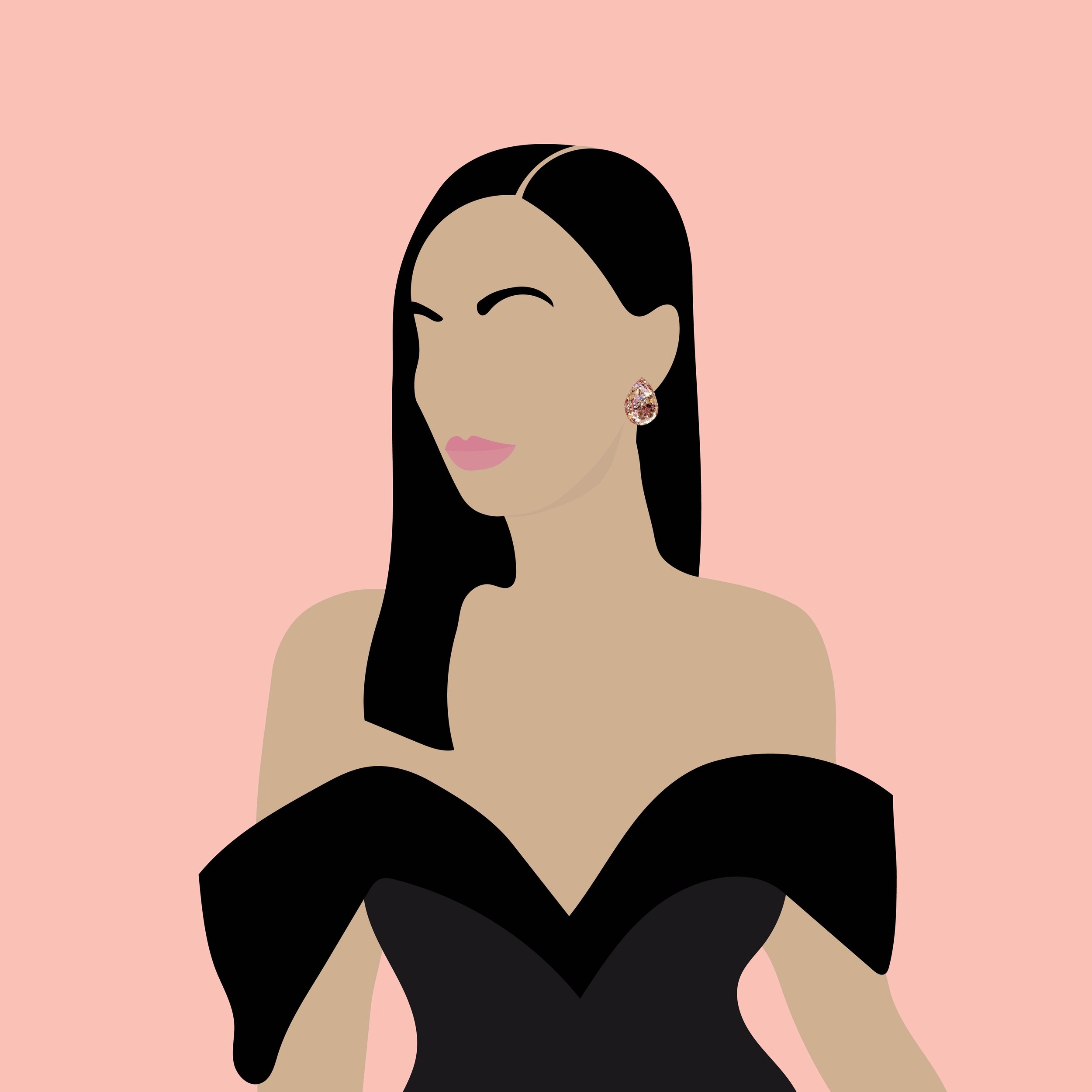
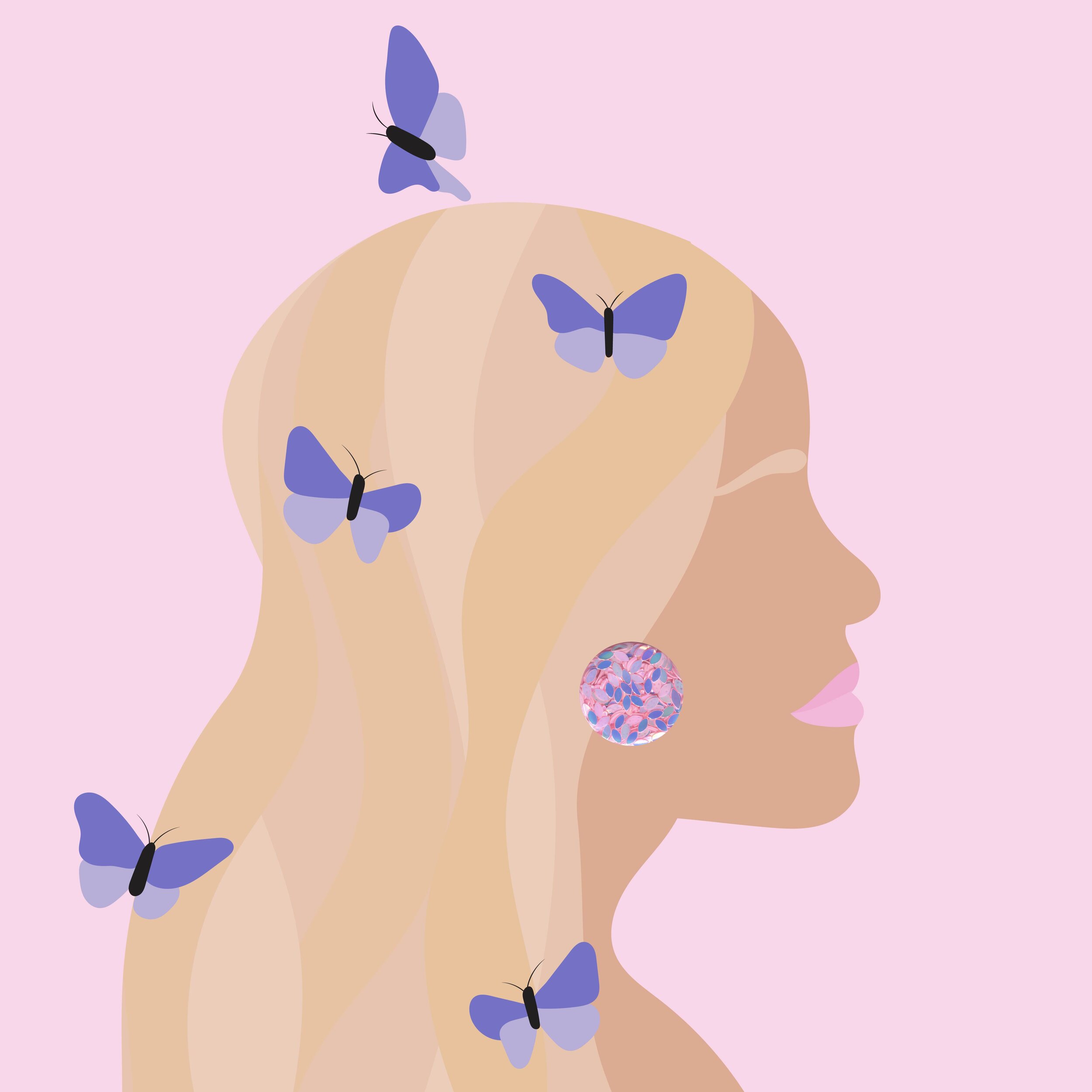
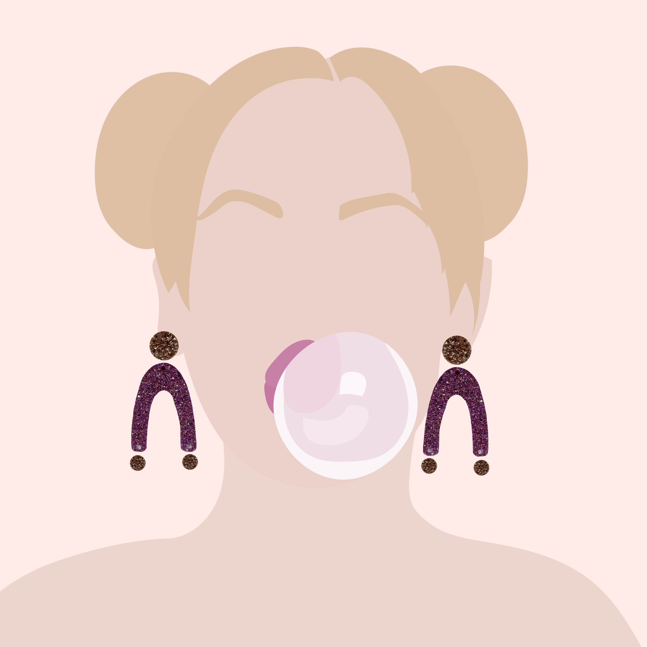
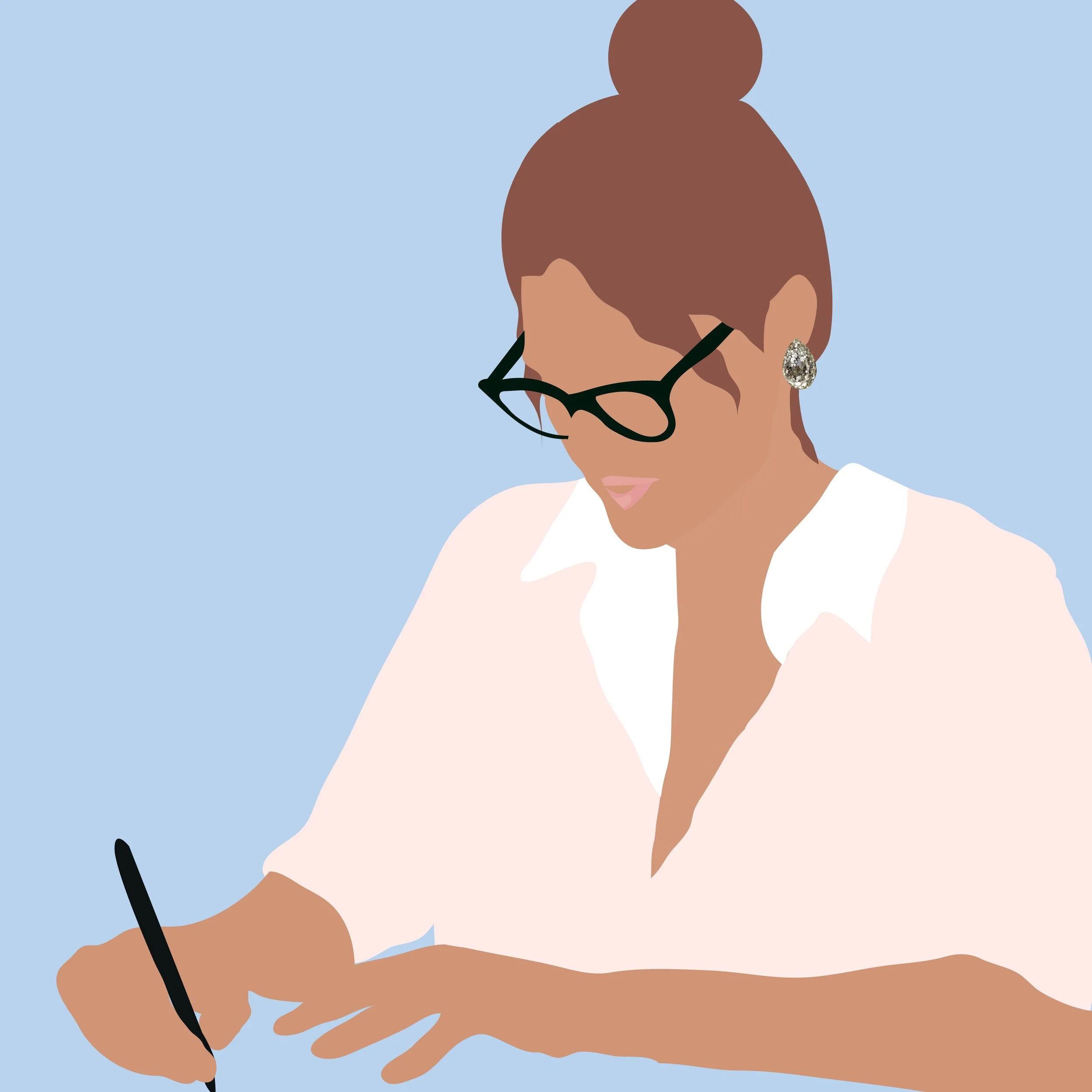
Meegan then also purchased a social media package where I illustrated beautiful women in different scenarios wearing their earrings.